CHICAGO STATE UNIVERSITY
BRAND IDENTITY STRATEGY & DESIGN
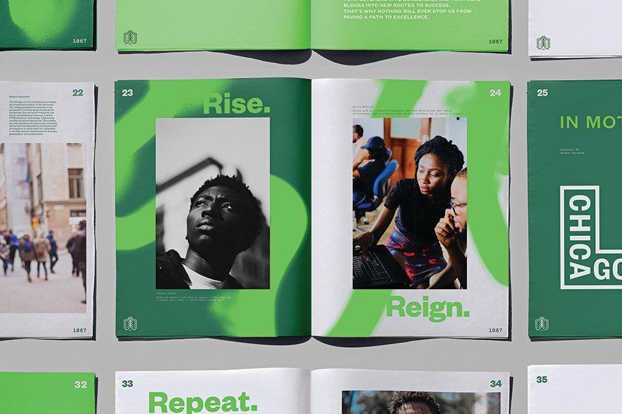
Chicago State University, a predominantly Black public institution, faced declining enrollment and funding, while its century-old tree symbol lost resonance. We revitalized the brand, positioning the university as a force for progress against all odds. The new identity features a simple tree growing with each page turned, symbolizing upward momentum. This strengthened the university's standing in Chicago and within the HBCU community, boosting enrollment.


